Back to Blog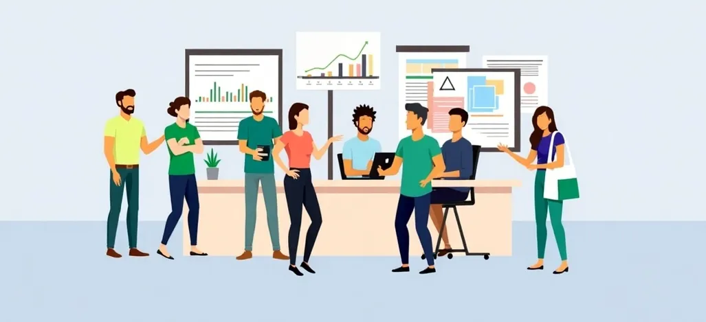
Startup
Adoption
Onboarding
User Experience
Retention
Startup Lessons: How to Boost Early Adoption?
August 3, 2025
PMF Company
Loading content...
I'm obsessed with puzzles, jigsaws, crosswords, Sudoku, anything that challenges my brain.
I had never mastered the 3×3 Rubik's Cube until recently. But then I discovered the Megaminx, a 12‑sided puzzle. For nearly a month, I chipped away at it layer by layer, starting with the usual white face.
Then I tried something different: I began from a different color. A process that used to take 10 minutes to solve the puzzle suddenly needed 20. This is because my brain expects specific color arrangements, blue, red, yellow next to white. When the order changed, I stumbled.
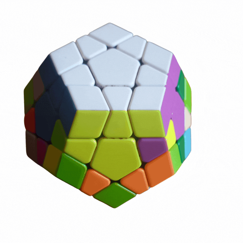
This isn't just about puzzles, it's a lesson in habit friction. As Nir Eyal explains in Hooked, our brains favor familiar patterns. Even minor shifts in flow or layout feel uncomfortable. And while some users patiently relearn, most users give up quickly.
So what does that mean for app adoption?
✅ You've driven traffic via ads or cool messaging.
✅ Install happens.
❌ But if users don't hit the value moment fast, within a few minutes, they'll abandon or forget the app entirely.
❌ And once it lands in "unused apps", it's rarely reopened.
You don't need everything in the first versions. Focus on that one "painkiller" feature that solves a clear problem. Then optimize onboarding to make that value immediately visible.
Example: Kitabisa, an Indonesia's donation app overhauled onboarding to emphasize core features like donation flow and simplified guidance. This resulted in a 30% lift in week-on-week retention and 2× average donations per user.
Show them the most important features first to get them interested, work on the additional features later.
When users download an app, they're looking to quickly experience how you solve the problem that you promised in your ads. Of course, not all features are going to be obvious, so take them on a quick tour and show them how to use your app efficiently. Help them visualize the results of using your app.
Lead users on a guided but minimal path:
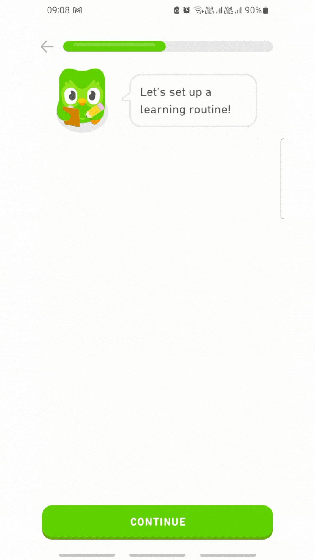
For example, Duolingo lets users translate a few words before sign-up, letting users experience the win fast. Their retention after day one is over 55%. They have the most engaging onboarding journey and by the end of it, users are already excited to start their learning journey.
Cluttered interfaces or crowded flows cause cognitive overload. Don't ask users to figure it out later. They won't. Make it easy for them and they'll stick to the product.
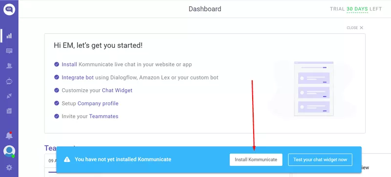
For example, Kommunicate, a B2B chatbot platform, simplified adoption by adding an interactive checklist and key feature calls. Signup-to-integration increased from 40% to 60%.
Retention isn't about load more features, it's habit design. Use Nir Eyal's Hook Model:
The more you reinforce these loops, the more likely users loop back instinctively.
| Element | What to Do |
|---|---|
| Core Value Focus | Identify the "wow" moment, build around it |
| Onboarding Simplicity | Cut friction, show value fast |
| Clean UX Flow | Reduce cognitive load; eliminate noise |
| Habit Triggers | Build small loops that reward users |
That Megaminx taught me: comfort beats novelty until the brain adapts. Users drop off not because your product lacks value, they drop off because you introduced unfamiliar flows too early. Solve core needs first, then onboard habit, one step at a time.
Want help applying this for your startup?
I'd love to review your onboarding flow or retention model.
Book a call here